Utah National Parks
Role:
Web Designer
VR Designer
Tools:
Figma
Affinity Photo
Adobe Photoshop
PTGuiPro
Pano2VR
Timeline:
5 Months
Overview
Bringing the Parks to Everyone
Utah's Five National Parks are physically inaccessible to users with mobility limitations, disabilities, or geographic restrictions — yet the existing NPS website offered no alternative. Commissioned as a sponsored brief with Meta and the National Park Service through a university partnership, our team of five was tasked with redesigning the site and integrating immersive 3D virtual hike tours to close that gap. The inherited site was visually inconsistent, carried approximately 12 WCAG accessibility violations, and failed the audience it was built to serve. Addressing those failures while preserving the natural identity of Utah's landscape became the defining challenge of the project.
My Role
Across a team of five, I owned two areas: the full VR/360 production pipeline and the visual design of the redesigned site. Both required decisions that had direct consequences on accessibility, usability, and how the final product felt to users who may never set foot on these trails.
VR Design
Building Immersion Without Barriers
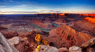
Delivering a credible virtual hike experience required more than software — it started on the trail. Our team personally went to all 5 National Parks in Utah to capture the source material firsthand. I was fortunate to be with the team at Bryce Canyon National Park and Canyonlands National Park, using an Insta360 X5 camera to capture the designated spots on the various trails that we had mapped out. This decision was deliberate: stock imagery or third-party assets would not have produced the environmental authenticity the project required. If the goal was to bring these parks to users who could not reach them, the photography had to be real.
Back in Post
The core constraint was delivering 360-degree panoramic environments in a format that worked across devices without requiring specialized hardware. I used Affinity Photo, Photoshop, PTGuiPro, and Pano2VR to manage the full pipeline. Every image was color corrected and cleaned up for precision stitching; aligning multiple photos into seamless 360-degree panoramas, correcting for lens distortion, and eliminating visible seams. From there, each panorama was reviewed, retouched, and organized by location and trail sequence before being brought into Pano2VR for final configuration and web export. Preserving the natural quality at each stage. The virtual hike tours would be embedded directly into the redesigned site, making immersive access available to any user with a browser.
Iteration
Pain Points
The existing site from the previous group had approximately 12 documented WCAG accessibility violations: broken contrast ratios, missing alt text, unlabeled interactive elements, and a navigation structure that assistive technologies could not parse. Beyond compliance failures, the visual design had no clear hierarchy and gave users no sense of orientation. These were not isolated issues — they were systemic, and they made the site functionally unusable for the people who needed it most. These failures established the non-negotiables for everything that followed.
From Research to Structure to Design
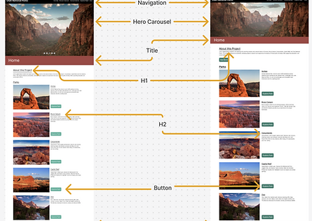
The process was established using a MoSCoW framework — accessibility, VR tours for all five parks, keyboard navigability, and responsive navigation were locked as non-negotiable before any design work began. From there, a flat information architecture placed each park as a direct branch from global navigation, keeping wayfinding predictable at the structural level. Wireframes were built component-first across 24 screens — desktop, tablet, and mobile — defining reusable parts before full page surface comp layouts were assembled.


One Decision Worth Explaining
The most significant design decision I made was around color. Utah's Five National Parks have a visual identity defined by earth tones, and abandoning that in favor of a generic accessible palette would have produced a site that felt disconnected from the places it represented. Instead, I committed to making both work simultaneously. The palette was built to honor the landscape and then stress-tested against WCAG AA contrast requirements, with specific hue and lightness adjustments made wherever the two goals conflicted. The result was a site that is visually grounded in Utah's natural environment and fully compliant.


Testing
User Tests
Every structural decision tied back to a specific violation from the audit. These decisions were then tested with 16 participants. For the user tests each, participant looked at either a mobile or desktop version of the prototype website. We gave them 4 tasks to complete and observed what challenges they faced when doing so.
User Tasks:
-
Explore the app for 30-60 seconds
-
Find the Bryce Canyon page
-
Find the Angel’s landing tour (Zion’s national park)
-
Find the about page
Observations:
-
Hero images were too large, made users confused
-
About page was difficult to find
-
Navigation bar elements were too close
-
Better hierarchy for visual components
-
Difficulty navigating back to the home page
-
Turquoise color on buttons did not have enough contrast for easy readability
What the Data Actually Said
The first round of testing produced a clear and surprising result: users were consistently confused and struggled to complete the tasks. That outcome contradicted what the research had suggested and forced a direct response. Findings were prioritized by frequency and severity.
Re-iteration addressed four recurring friction points:
-
Navigation labels restructured after users repeatedly hesitated at the primary menu
-
Visual hierarchy adjusted after users scanned past key entry points
-
Wayfinding cues added after participants lost orientation between park sections
-
Tour access surfaced higher in the page structure after users failed to locate it without prompting
Once the site was re-iterated, the users were asked to repeat their tasks. They were all able to easily execute the tasks.
Delivery
A Measurable Outcome
The completion of the VR Tours and re-design of the website will allow users to visit the National Parks of Utah in a way they would never be able to do prior. Redesigning the site to full WCAG 2.1 AA compliance resolved all 12 identified accessibility violations. Across 16 user test participants, 100% task completion was achieved, with re-iteration directly reducing friction on four recurring pain points including navigation, hierarchy, and wayfinding.